
BART Kiosk Re-Design
- teestadas

- Oct 11, 2018
- 5 min read
Updated: Oct 12, 2018
The Design Challenge
We have been doing a 3 week research on the usability of the current BART kiosks. Me and my collaborators decided to work with on foreigners who were entering the San Francisco Bay Area via the San Francisco International Airport and looking to use a mass transportation system. We have been looking for opportunities to improve this system.
Week 1 collaborator: Yuchen Tong
Week 2&3 collaborator: Ricky Cheung
At the Milbrae Transit Station, as it is one of the bigger stations and also a station where lots of change-overs happen. I could empathize with several foerign travellers, I have experienced my home country system which is India's New Delhi Metro or Mumbai Metro and New York's Subway System- the SF BART is definitely different.

The machines for all different tasks are located in a row, however difficult to approach without confusion. We saw many travellers getting confused in their rush to buy tickets as the first screen asks you payment options.


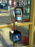


The Clipper Card Machine itself has many tasks connected to it. How to buy it, how to use it, where to use it, how is it cheaper etc. Many commuters use a clipper card to save time. Travelers from outside staying here for longer time would also use the clipper.


Buying a Ticket at the Ticket Kiosk also entails the need to remember or refer to the BART System Map for Destination station names and planning routes. We saw several travellers refering to the BART Fare chart which is stuck on the kiosk. However it is difficult to read immediately as the station names are in alphabetical order and not on a map. The ticket machine interactions also include payment, like the clipper card kiosks. What is interesting is that its a "pay-first" system, than "pay-later".


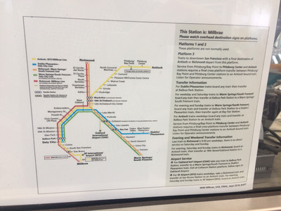
The information systems needed for booking tickets, are located far from the kiosk and reading them is also difficult.


We stood and observed several travellers and commuters, and also did short intercept interviews with some to understand the frustrations when we saw.


We found several important parts of the research, during our debrief, especially when creating the elements and system map. Some elements were tangible, some even intangible.


After capturing the elements, we also spent some time to prepare a broad Systems Map of the Kiosk Experience and the common taskflows and wireframes.


While creating the taskflows, learnt how it would be challenging for new users as they are not familiar with the place and locations, and the introduction to new words out of context, would make no sense to them. Also the Tasks were long.
Therefore, for next 2 weeks of the project, I decided to work on a a challenge to make the experience of a persona of Foreign travellers, familiar with their home country's train commute and who are new to the city and wish to commute while they are here. These travellers would be staying in the city for a week or more and prefer to save money on their travel, so they look for alternatives to travelling by road.
Personas developed for this phase were:
1. Independent middle age couple travelling to meet their son studying in the city
2. Asian Businessmen travelling for a week-long conference to the city
3. Middle aged lady from Iran, exhausted after her 16 hour long journey to SF.


We had to sketch out the needs, goals and behaviours of our Persona. The methodology used is also Provisional Persona sketching.
The Key use for Mr Mathur is that he and his wife are travelling from India and are here to meet their son for 2 weeks and are familiar with the city. They would like to use the BART to reach home as they are reaching during their son's college hours. They know the address. They would also like to be independent and move around the city on their visit this time around. He also has a conference for a 3 days near Embarcadero, which he needs to plan for and while he is away, Mrs Mathur would like to visit few other places with her local friends she made during her last trip.
DESIGN STORIES:
1. Buy Tickets from Airport to Hotel
2. Buy Multiple Tickets at Airport Kiosk: Hotel to station nearest to Conference Venue & Hotel to station nearest to friend's place
3. Buy Clipper Card
4. Buy Multiple Tickets to Tourist destinations through the app and collect the tickets at the Kiosk
TASKFLOWS:
Task: 1
Buy Tickets from Airport to Hotel

Task 2:

Task 3:

Prototype 1 was created with initial wireframes and tested with passengers waiting to transit or depart at the SFO International airport lounge.

Here's a link to the Prototype: https://invis.io/B7OFX5VZKMP
In order to test the Prototype, we prepared a script which we shared with our participants as we introduced ourselves:
Usability test script:
Introduction:
Hello! I am Teesta. I am studying Interaction Design at SF. Do you have 15-20 mins to help me with some feedback for my project? It is a prototype of a Kiosk experience at the subway here.
The purpose of the study is to understand if the process and flow shown to you, resonates with you or not. It is a very low-fi prototype, and not everything works perfectly. If you can explain your understanding honestly as we move to different pages, will be great! Please think aloud, it will help me to understand.
I will be recording our conversations in audio, video and writing some notes. I won’t be asking for any personal information and will only use this for class purposes. Hope you are okay.
I will be sharing a few screens with you and testing the pages. And not you. There is no right or wrong answer. Please share your honest feedback and talk while you are on the page.
Thank you so much for your time!
Background Info:
Which country are you from? How long was your flight to here?
How long will you be/ were staying in SF?
Which part of SF are/were you staying in?
What will be/was your primary mode of transport here?
Did you use the subway system here during your stay?
Have you used the subway system in your own country? If so, how was this different?
Task Scenario:
You are at the SF Airport BART Kiosk visiting SFO, with your wife, visiting the city for a week for a conference. Your son is also living in the city, but you don’t want to bother him and feel you can manage this well.
Design stories: 1. Buying a Ticket for today, for you and your wife
2. Buying round trip tickets for 4 days, for your commute to the conference at Embarcadero.
3. Buying a Clipper Card, for your wife to use when you are away at the conference.
During the test:
Can you tell me about this screen?
What would you do next?
Would anything here concern you? Or feel unnecessary?
Post Test:
How did you find the experience?
What was different?
How was it similar to the one at home?
What can I do to make it clearer?
Tell me what you understood?
Any other suggestions?
Thank you again for all your time! Have a safe journey!
Post the rich discussion, I was able to modify my prototype further and prepare it in time for our class critique. Here's a link to the 2nd iteration: https://invis.io/GXOGPQ5FQWM
Here's a link to Ricky's personas, taskflows and wireframing: http://goricky.net/2018/10/01/bart-kiosk-wireframe/
Comments